

Site Banners: To Rotate or Not to Rotate?
We’re working with a client to develop a plan to revitalize their Web sites. In a discussion focused on homepages, a specific topic came up: banners. More specifically, there was a straightforward question: what’s better, static or rotating homepage banners?
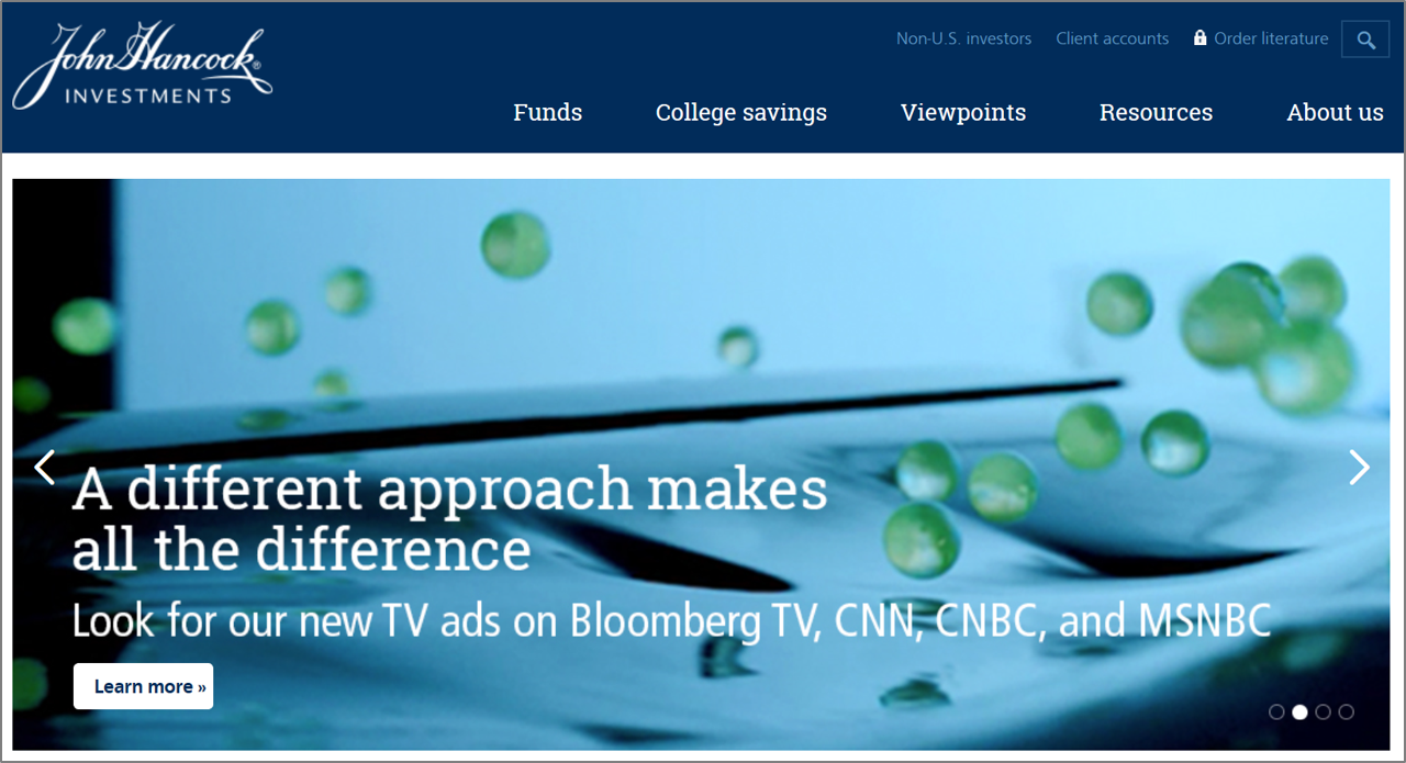
It’s a tactical question but an important one given the importance of engaging users via the homepage experience. And while many have personal opinions, let’s start with a simple analysis.
What Does the Industry Do?
First off, almost every firm presents some type of banner, though there are a few exceptions. So I examined the homepages of 20 firms’ advisor sites. Here’s what I saw:
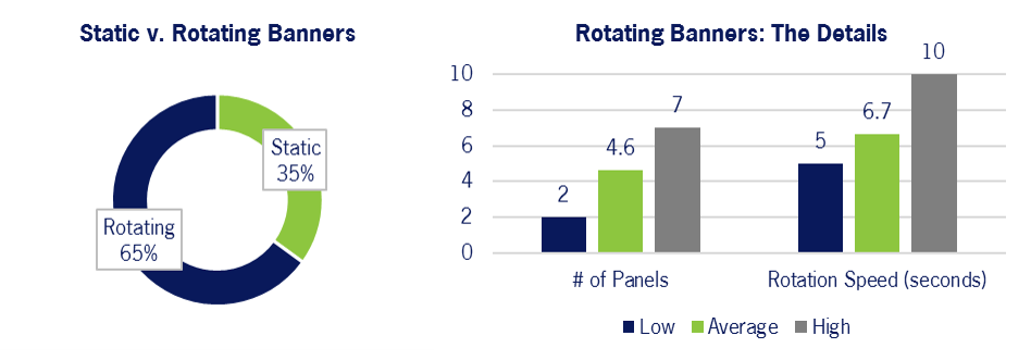
By roughly a 2:1 margin, firms utilize rotating banners. The rotating banners vary in terms of execution; static banners do as well, with approaches roughly evenly split between promoting product and highlighting thought leadership.
Does it Matter?
The effectiveness of any banner depends upon numerous factors – size, visual design, specific text – so there’s no absolute clarity on if a static or rotating approach is categorically better. That said, I think there are two issues that tip the scales toward static presentation:
- The Data: if you review all the studies done on the success rates (i.e., clicks, conversions) associated with static v. rotating banners, you’ll get a somewhat mixed picture but one that I’d argue slightly favors static. That, plus the fact that 2nd/3rd/4th panels in a rotating banner generate poor response rates, supports a static approach.
- Usability: rotating banners bring some baggage relative to their static counterparts. The motion is distracting; auto-rotation lessens users’ control of the site experience; and timing the rotation can be a tricky proposition (i.e., too fast and users can’t fully digest the message, too slow and they won’t wait for the next message to appear).
Still, this is far from a clear-cut issue or one that is specific to asset management. The same variation in banner delivery is seen in the pharma industry, for example, where the top 10 firms’ sites are evenly split on static v. rotating banners. So while I expect firms will continue to execute differently, it will be interesting to see if a stronger consensus (or an entirely new approach) develops.
