Improve Your Blog (3 of 5)
In the last year, industry blogs have improved dramatically. We’ve seen firms inject personality (our first part in this series) and increase the frequency of posts (our second part in this series). This post covers including graphics (not stock photography).
Most blog posts topics cover (or begin with) macroeconomic issues. That makes sense for a few reasons. First, macroeconomic issues don’t worry compliance too much. An analysis of Greek debt has no inherent product push or firm advertisement. Second, investment teams are (often) analyzing big themes for investment opportunities, so the blog post can be a natural output from the analysis.
Yet, many of these macroeconomic blog posts are solely prose. We think that’s a mistake. One or two straightforward graphics enable the viewer to understand the author’s perspective and quickly decide to read (or not) the prose. A well-placed graphic increases the likelihood a blog post is read (especially when the post is more than 1 – 2 paragraphs).
Here are two examples from recent best blogs of the week.
AllianceBernstein – This post is about Japanese equities. The reader understands that from the title: “Why Japanese Equities?” Immediately there’s this graphic and the message a reader expects is one about relative cheapness. That’s helpful.
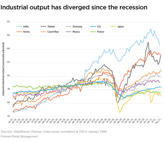
Putnam – This post is about discrepancies in global bond yields. The first (of two) graphic tells the reader that there’s going to be a connection between national productivity and yield. If that relationship impacts an FA’s client portfolio, then this blog post becomes immediately valuable.
As your firm considers improving or starting a blog, have a plan that includes graphics and data visualization. It’ll make the blog more appealing.


