Thoughts

Wildcats

March Madness 2017

Many of you are thinking about brackets and who to place in the Final Four this year. It’s a big year for Mike (and seemingly 50% of the ESPN television personalities) as his Wildcats are in the Big Dance for the first time. Ever.

(Needless to say, Northwestern getting in was properly celebrated:

– Mike)

So for what it’s worth (i.e., literally zero), here are Final Four picks:

East Midwest South West
Anu  Villanova Oregon UCLA Arizona
Mike  Wisconsin  Michigan Butler  Gonzaga

Plus two thoughts from me:

  • Always take Mike’s picks over mine. In any sport.
  • I’m putting the Shockers and Mustangs through to the Sweet Sixteen.

And Mike:

  • Nobody will remember my picks when it’s said and done so I’m going with selections that will (a) make me happy and (b) not be viewed as too insane.
  • I’ve seen Duke, Kentucky, North Carolina, and a number of other schools win enough already. Let’s all root for underdogs!

(photo courtesy of The Daily Northwestern)

Homepage

Site Banners: To Rotate or Not to Rotate?

We’re working with a client to develop a plan to revitalize their Web sites. In a discussion focused on homepages, a specific topic came up: banners. More specifically, there was a straightforward question: what’s better, static or rotating homepage banners?

JH Banner

It’s a tactical question but an important one given the importance of engaging users via the homepage experience. And while many have personal opinions, let’s start with a simple analysis.

What Does the Industry Do?

First off, almost every firm presents some type of banner, though there are a few exceptions. So I examined the homepages of 20 firms’ advisor sites. Here’s what I saw:

Banner Data

By roughly a 2:1 margin, firms utilize rotating banners. The rotating banners vary in terms of execution; static banners do as well, with approaches roughly evenly split between promoting product and highlighting thought leadership.

Does it Matter?

The effectiveness of any banner depends upon numerous factors – size, visual design, specific text – so there’s no absolute clarity on if a static or rotating approach is categorically better. That said, I think there are two issues that tip the scales toward static presentation:

  • The Data: if you review all the studies done on the success rates (i.e., clicks, conversions) associated with static v. rotating banners, you’ll get a somewhat mixed picture but one that I’d argue slightly favors static. That, plus the fact that 2nd/3rd/4th panels in a rotating banner generate poor response rates, supports a static approach.
  • Usability: rotating banners bring some baggage relative to their static counterparts. The motion is distracting; auto-rotation lessens users’ control of the site experience; and timing the rotation can be a tricky proposition (i.e., too fast and users can’t fully digest the message, too slow and they won’t wait for the next message to appear).

Still, this is far from a clear-cut issue or one that is specific to asset management. The same variation in banner delivery is seen in the pharma industry, for example, where the top 10 firms’ sites are evenly split on static v. rotating banners. So while I expect firms will continue to execute differently, it will be interesting to see if a stronger consensus (or an entirely new approach) develops.

PIMCO Logo

PIMCO Makes Changes to BOND

Last week PIMCO announced changes (PDF) to its flagship Total Return active ETF, BOND. The gist: different investment focus to meet changing investor needs, new management team, same ticker.

I had a quick comment in the Ignites story (subscription required) on the change in which another observer stated that the appropriate move for PIMCO in this case is to launch another product, not tweak BOND. I find the move interesting enough that I thought to cover a few more things. So, three points each on two topics:

What’s Important About the Context Surrounding the Change?

  1. BOND is roughly $2 billion in assets. Not to minimize those assets, but they’re small relative to the whole of the Total Return strategy (75B+ in the mutual fund alone) and the firm’s $1.5 trillion in AUM.
  2. In general, active ETFs have not taken off as some have hoped. It’s difficult to project that PIMCO’s changes to BOND put a significant short or mid-term influx of assets at risk.
  3. Positioning the move as being grounded in the changing needs of investors is (a) appealing given the nature of today’s bond market, and (b) credible given that PIMCO is altering a product that has performed well, not poorly.

So Why Might This be Worth Doing?

  1. The Total Return strategy has been on the defensive since the fallout from Bill Gross’s departure. At least for the ETF this move enables PIMCO to focus on client needs and the new (and strong) team as part of a more positive conversation.
  2. Transitioning an existing product avoids adding another active ETF into an already-crowded ETF market and one that (again) has not been overly conducive to active funds.
  3. The scale of the assets involved makes this a potentially-appealing learning exercise from a strategic standpoint. PIMCO can mine the implications of pivoting existing ETF offerings, recasting the messaging for Total Return, and the like. (I realize this is far-fetched but the move has me thinking about adopting the regular reinvention strategy of Chicago’s famous Next restaurant for an ETF.)

There are so many nuances to consider. Even the fact that the ticker symbol is unchanged has implications. After all, if people know only one thing about active ETFs, fixed income ETFs, and PIMCO ETFs, the BOND ticker is probably it. Will the ticker being the same undermine efforts to communicate the changes?

It will be interesting and fun to see how this ultimately plays out.

A Quick Look Into FinTech

Last week I visited the offices of a New York FinTech leader. FinTech is attracting copious news mentions and billions of investment dollars (see chart below). We’ve helped a handful of asset managers understand and plan for the emergence of robo-advisors (a subset of FinTech), so gaining a fresh perspective was very exciting to me. As I walked around the offices and spoke with people in different business functions, three thoughts came to mind:

  1. This company understands the long game is just starting. They talk in traditional consumer financial services terms like cost of acquisition and lifetime customer value to predict future profitability with psychographic, life-stage, and attitudinal data. It is a different mindset than intermediary-oriented asset managers. When speaking of financial advisors, I often hear some sort of bracketing of financial advisors (i.e., dabbler, bronze, silver, gold) based on past sales production.
  2. The competition is Google, Facebook, and Amazon. The team sees those companies as the primary competition because they all possess massive, active, and trusting customer bases. Seeing these technology companies as the competition reinforces the emphasis on cost of acquisition as a company like Amazon could immediately begin marketing an end-user FinTech service to a global customer base (similar to marketing Prime to the 260MM+ customers worldwide) and have a cost of acquisition many times lower than a new entrant.
  3. People spoke to me about asset managers as key partners and not competitors. Not one person I spoke with mentioned a desire to start buying/selling individual securities in a commingled vehicle. So FinTech (robo-advisors in particular) becomes a new distribution channel for asset managers. And with any new (and successful) distribution channel, the incumbent channels will lose share.

This was a highly interesting afternoon. I started to mentally sketch a few conclusions lightly. For now, I’ll keep them to myself but would love to hear your thoughts. Send us a quick e-mail with ideas or better yet, a place and time to discuss over beverages.

 FinTech

Data Presentation

Can We Make Data More Digestible?

25 home runs. 100 runs batted in. A .293 batting average.

Those data points, in part, summarize the 2016 baseball season of Jose Abreu, the best offensive player on my favorite team, the Chicago White Sox. Baseball has undergone a huge statistical revolution over the last 20 years. I chose three very traditional data points for Abreu, but the fact is there are literally hundreds of individual stats tracked for players these days.

All of that data is well and good, but digesting it can lead to a very simple question: just how good was Jose Abreu in 2016? It turns out there’s a clear answer to that question, because one thing baseball has done very well is simplify complex data.

For example, there’s a statistic called Weighted Runs Created Plus, or wRC+. It summarizes a player’s entire offensive value in a single number. Without diving into the technical details, two things make wRC+ very effective:

  1. It adjusts for context. Specifically it adjusts results based on (a) league-wide averages, and (b) the stadium the player plays in (since some are more or less friendly for offense than others).
  2. It summarizes everything in a SINGLE number. A wRC+ value of 100 represents league average. Every point above or below that represents a result that is 1% better or worse than average. So, Abreu’s wRC+ of 118 means he was 18% better than the average offensive player last season.

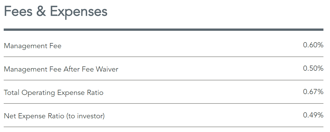
That’s a lot of baseball… what’s the point? Simply put, I think baseball’s ability to present data in a digestible manner has potential for asset management. Consider expenses as an example. A common presentation is to present expense ratios directly, as Dimensional Fund Advisors does here:

DFA Expense Ratio

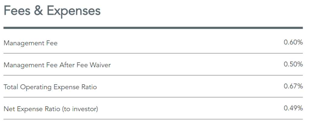
But how much does that really help? Sure knowledgeable investors and advisors have a good notion of what is high or low when it comes to fees, but not in any systematic or (frequently) very precise way.

Providing category or peer data alongside that, as Morningstar and some managers do, certainly helps. But even there an investor or advisor is left to mentally digest the scale of the difference.

So what if data like expense ratios was represented via a more comprehensive statistic that combines product-specific and category-average data into a single number scaled against 100, much like wRC+? Let’s call it the “Expense Index.” For the DFA fund noted above, the Expense Index would be 38, immediately communicating that the fund’s expense ratio is 62% lower than its peer group.

I can envision many applications for this type of normalized data. Of course there are questions. For example, without an external / regulatory requirement would firms want to be so direct, especially with data like fees? I mean, many would want to avoid showing an Expense Index of 150.

So there is some thinking to be done on what information is most conducive to such an approach. Even so, simplifying and providing context around data strikes me as an opportunity worth of more exploration.