

Straying from a Standard Can Be Dangerous
Our clients know we dig deep to unearth findings and recommendations worth pursuing. Sometimes that leads us to cataloging fact sheet data points across asset classes and boundaries (curious to the most frequent MPT stat in Belgium? Ask Mike!) In regulatory materials, there’s not much deviation from the status quo. Occasionally you find something slightly unusual and pause. We’re advocates of the Eaton Vance Fund-Approach-Features start to each fact sheet (like in this Small-Cap Fund). A qualitative description is a good place to deviate and try something compelling.
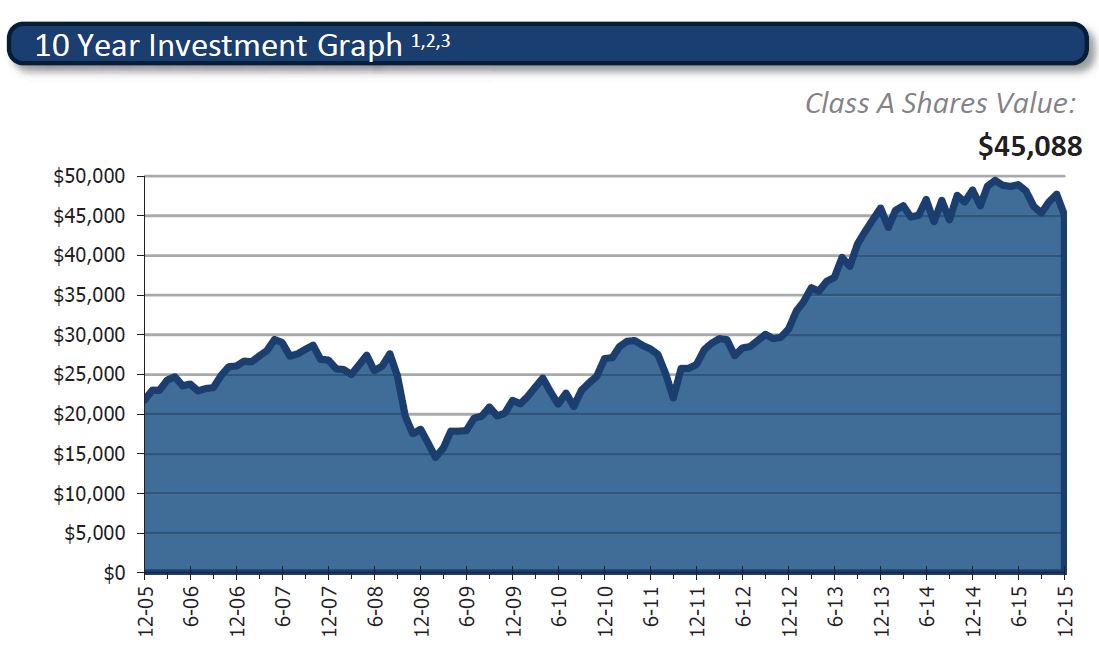
What is a bad place to deviate? Any $10,000 investment graph. Imagine our shock when seeing the above chart included in a fact sheet.
What’s your first question when looking at this?
If you’re like me, you’re wondering how come this chart begins at $22,500 (roughly)?
Well to understand why, you need to read the endnotes (located on page 2) describing the chart as showing growth of 10K from inception (Class A – 1994). You would need a chart starting in March 1994 to show the growth of 10K into $45,088.
I can’t find an industry leader that shows a chart like this on a retail mutual fund. The aforementioned Eaton Vance chart shows the standard practice of starting at 10K, 10 (or 5) years ago.
Vanguard and BlackRock exemplify the standard Web practice with different time durations but always beginning at a standard $10/$100K.
Though most likely compliant, this chart feels dishonest in its departure from industry standard practices.